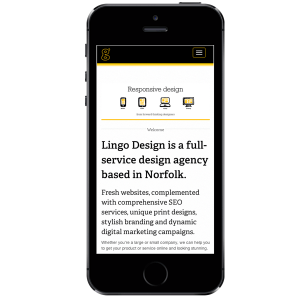
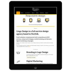
 Lingo has a new website – and we’re rather proud of it.
As much as we loved our old website, it wasn’t responsive.
That’s to say, it was predominantly designed to look and perform at its best for a desktop or laptop computer, rather than the smaller screen-sizes of a phone or tablet.
Responsive websites however are built to be ‘intelligent’ enough to know whether they are being viewed on a desktop, laptop, tablet or smart phone – and then adapt accordingly.
Why make the change?
Thanks to the fact that Google Analytics was running on the Lingo website,  we knew that 17.5% of our site visitors used their smart phones and 11% were on tablets.
At 28.5% in total, this meant nearly a third of visitors were not able to experience our website at its best.
What’s more, there had been an incredible increase in mobile visits of 113% when compared to the same period last year.
With so many website visitors using mobile technology, it was clear that our site needed to keep up with the shift in customer behaviour. Which is why we chose to rebuild and relaunch the Lingo website using responsive design.
What’s the trend nationally?
A recent study carried out in the UK suggested that over the course of 2013, mobile visits rose from 23% to 40%.
 It concluded that by mid 2014 mobile could be expected to have overtaken desktops completely!
Of course this is the national average and percentages can be expected to vary depending on industry sector.
However the message is still clear; mobile website traffic is growing at a very fast rate.

